For me color is about observation, but it is like scent: it runs a straight path past the right brain and goes straight into a nameless sense of joy (or pain) when it hits a nerve. It is possible to analyze why this could happen, but to quantify it into a teachable lesson seems similar to teaching you how to choose your next lover based on a logical system.
I have biases: I like a certain amount of complementary challenge in my palettes. I am bored by most monotones, prefer a triad of colors at the least. I much prefer layered color rather than flat, and the yellow ink runs out in my printer at twice the rate of the other toners, meaningthat I prefer a warm palette. I think ideally a palette should include, in some form, a variation of all 3 primaries.
When my daughter Rose used to pester me about what my favorite color might be, I would answer (poor girl!) that it was impossible to have a favorite color, much like it is impossible to have a favorite child. Taken on their own, there are hues I like more and hues I like less, but color is never isolated, and a color I might love can become an eyesore used i n the wrong context.
 |
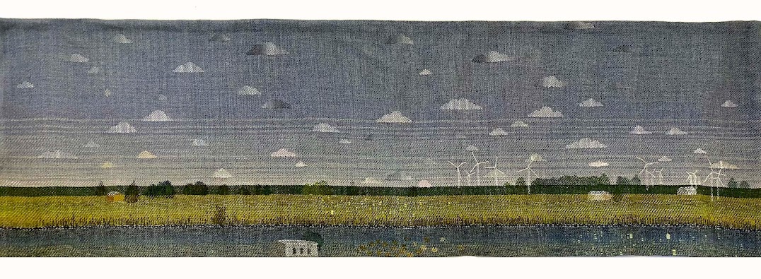
| design for a rug, (c) 2011 Laura Foster Nicholson |
I share your passion for color as well! After the color aspect is settled... I go for the texture aspect. Texture is also often down-played. I find it as a vital and truly inspirational part of design that makes one wonder... "Hmm.. now where did that one come from?".. an idea that brings on more and more conversation afterwards. I enjoy reading your information on Linked In, and your work is very nice. I appreciate all the feedback and notable information you pass on to others on Linked In! Glad to know we both find it as a difficult task to define our "favorite color" like so many other designers.
ReplyDelete