About Me

My photo
I am a studio artist and textile designer. My work swirls around among art, design, and the joy of making things. I founded LFN Textiles Artists Ribbons in 2002, and have been designing these fairly wonderful ribbons for 8 years now. They are distributed for the wholesale market exclusively by Renaissance Ribbons, and are available at retail on my website, www.lfntextiles.com, and nationwide through fine fabric stores, gift shops. My tapestries are available through a number of galleries across the country as well. See the links section for contact information.

Thursday, December 12, 2013

Radiant Orchid?

As a designer I have been involved with Pantone for some time, often with a quizzical attitude due to the impossibility of naming and numbering every single possible color (I never seem to find Pantone numbers for the colors I choose!).  And yet I have the privilege of writing for Pantone View, their quite wonderful online magazine about color, and I have a great time doing it.  I love color.  I often have said that an artist (or designer) can't afford to love or hate any color -- it is all about context.  So, here all week I have been digesting the news about Radiant Orchid, Pantone's Color of the Year for 2014.  (18-3224 TPX)  Oh, dear, not my favorite color.

from PantoneView.com

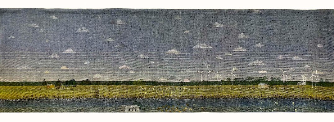
But!  now there is an opportunity to be challenged!  I am not very interested in overtly following trends but there is something of a thrill in taking on a difficult subject (orchid?) and making it work in something beautiful.

I remember many years ago working on a commission for a very highly respected interior designer in Chicago.  One of the women on her team was examining a tapestry I was presenting, and landed her beautifully manicured nail on a spot of color in the piece and uttered, with barely disguised contempt, "Pink?"  It really was a kind of orchid/fuschia pink, as I recall.


Yet what would this piece be without it?  So I am going to play with this one.  Slip it in, here and there.  Use it as a witticism, or a little hint of passion.  Watch this space.

2 comments:

  1. Know what you mean- that is a tough one to use!

    ReplyDelete
  2. Ah, great! Can't wait to see the ideas! I'm thinkin' you either gotta go equally bold to tone it down, or play it up with pastels, or steer it towards the cool blue side of the spectrum....

    Funny thing is, this whole thing has been playing out in the garden world ever since Gertrude Jekyll pronounced magenta a horrific low-class color ;)

    ReplyDelete