About Me

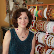
My photo
I am a studio artist and textile designer. My work swirls around among art, design, and the joy of making things. I founded LFN Textiles Artists Ribbons in 2002, and have been designing these fairly wonderful ribbons for 8 years now. They are distributed for the wholesale market exclusively by Renaissance Ribbons, and are available at retail on my website, www.lfntextiles.com, and nationwide through fine fabric stores, gift shops. My tapestries are available through a number of galleries across the country as well. See the links section for contact information.

Monday, April 29, 2013

linen - the natural source and the material source

Despite this chilly spring we are having in the Midwest, I have been thinking all winter about my favorite fabric, linen.  (I do have another favorite fabric, which is wool!)

I have been working wherever possible with linen in my adventures in screenprinting, loving its firmness, crispness, and the perfect, perfect neutrality of it raw flax grey color. (I painted the walls in my studio this color, as closely as I could match it).  It looks particularly good printed with black ink when I am shouting my manifestos about managing the household, garden, and one's personal ecology. (I sell these in my etsy store, Greenhousetextiles)


Linen can be expensive, of course.  Traditionally it had to be processed by hand.  It comes from the flax plant, the dry stiff stems, and is known as a bast fiber as a result.  It required a certain amount of wht we would call torture, were it applied to animals: retting (left in the fields after cutting, or soaking in a solution and then being left to rot until the hard bark rotted off), hackling or scutching (breaking its stiff limbs with a medieval looking machine), combing, before the usual spinning processes managed it from then on out.

I used to teach texile fiber properties to interior design students so I have these nifty pictures to show here:

Dew retted (from the fields) vs. water retted.

The resulting fibers are long, smooth and incredibly strong.  If you are reading this blog you may well be interested enough in textiles  to understand linen's prized qualities of absorbency and coolness in hot weather.  Nothing better than cool linen sheets on a hot summer night!  You may also know that the finer it is woven, the silkier it gets with washing (think linen damask table napkins.

This lesson was inspired by an email I read this morning from the best source for reasonably priced linen I have yet found (www.fabrics-store.com), and despite my rather good understanding of linen's properties, I learned a lot!

So here I quote from today's email.  If you want a good source for linen, this place is great!  The linen comes from Russia, and the color palette and weight variety is enormous.

  • The Durability Is Assured. Linen has an extremely high tensile strength that provides your projects with hardiness and longevity. In fact, it is known that Alexander the Great used layers of linen, called linothrax, as armor. Not to mention, linen is what was used to mummify due to its ability to last and preserve.
  • Enjoy A Fabric That Grows Softer With Every Wash. Just because it is durable, doesn't make it coarse. Every time you put the IL019 linen in the washing machine, it will become softer to the touch.
Features like these only begin to tell the story of Medium Weight Linen IL019. There are many other benefits that you'll enjoy from choosing linen:
  • Unequalled Thermo-Regulation. Unlike cotton, linen is naturally insulating in the cold, and cool and breathable when it is warm. Additionally, linen whisks moisture from the skin -- that helps keep you less sweaty and more comfortable! 
  • Defense Against Dirt. Because of its strong tensile strength and natural process, linen has been dubbed one of the purest fabrics out there. This gives it the ability to resist stains, dirt, and even the growth of bacteria. In fact, hospitals use linen thread for internal procedures due to its natural sterility.
  • Friend of the Environment? Linen production requires five times less pesticides and fertilizers than cotton. Our IL019 linen is made from the highest quality European Flax and comes from a mill and process that is 100% environmentally friendly. This is guaranteed by the internationally recognized Oeko-Tex certification..

Sunday, March 3, 2013

what we talk about when we talk about color

I live and breathe color, in my work and in my life.  I have frequently spoken of it here.  I have a sophisticated eye, if I say so myself, close to perfect pitch in the visual sense.  I never took a color class, which is not to brag, but it has hurt me in that I have never, as a result, known how I would teach one!

For me color is about observation, but it is like scent: it runs a straight path past the right brain and goes straight into a nameless sense of joy (or pain) when it hits a nerve.  It is possible to analyze why this could happen, but to quantify it into a teachable lesson seems similar to teaching you how to choose your next lover based on a logical system.

I have biases: I like a certain amount of complementary challenge in my palettes.  I am bored by most monotones, prefer a triad of colors at the least.  I much prefer layered color rather than flat, and the yellow ink runs out in my printer at twice the rate of the other toners, meaningthat I prefer a warm palette.  I think ideally a palette should include, in some form, a variation of all 3 primaries.

When my daughter Rose used to pester me about what my favorite color might be, I would answer (poor girl!) that it was impossible to have a favorite color, much like it is impossible to have a favorite child.  Taken on their own, there are hues I like more and hues I like less, but color is never isolated, and a color I might love can become an eyesore used i n the wrong context.

design for a rug, (c) 2011 Laura Foster Nicholson
I think, were I to teach a color class, the first exercise I would conduct would be to have each student identify a color they loathed, and make them work with it, in palettes, until they found a perfect home for it.  A shadow? a complement?  although I have waxed emotional about color, it is profoundly a tool: one can't afford to have either favorites or avoid colors one tends to dislike.

Wednesday, February 20, 2013

fabrics to come from LFN Textiles

Yesterday I signed an agreement with Troy Fabrics to have my designs produced as quilt weight fabrics in their Riverwoods collection.  Troy produced top quality fabrics with up to 16 screens per design for very subtle color gradations.  They are based in Chicago, and also distribute a number of other fabric lines.  There is something really comforting about working with a home-town company.

But what I am happiest about is that they love everything I do, and the first collection will be based on my recent vegetables group of designs and debut at Quilt market in October.  Here's a sample of what is to come:


s 


 I have always been stubborn about my artistic style and point of view, and I have been reluctant to design anything "for the market" if not also for myself. I like to do straightforward patterns but also love to do quirky ones.  Tomatoes was my very first ribbon design:  I thought it was really nice to contemplate a luxurious fabric like woven ribbon with images of kitchen vegetables.  it will be great to see Tomatoes, herbs, lettuces, green beans = a cornucopia of veg -- made up into tablecloths, but also quilts and maybe shirts too. 

We will be doing plenty of other subjects in upcoming collections, so watch this space.

Saturday, February 16, 2013

From ribbon to voile! thanks to Spoonflower

As a textile designer, I often license my designs across several formats -- ribbon, fabric, dinnerware.  Usually it is me doing the legwork to find the clients for licensing, but I had a very pleasant surprise last fall.  I have a very large portfolio of fabric designs on Spoonflower, and the occasional sale of my designs through that is gratifying.  Some of the patterns I post on Spoonflower are based on ribbons I have designed.
 

Here is my design from several years ago for my Dahlia Ribbon.  I love it: it is heavy satin with very beautifully articulated details in the weaves. I redesigned it into an allover pattern and uploaded it to Spoonflower,. 

Last fall I got a message from a clothing designer who wanted to order yardage for sampling, and if the samples showed well at the January trade shows, he would want a license so that he could produce it in quantity.  He chose to print on cotton voile, which is a nice summery choice.  For this I earned my designer commission form Spoonflower.

This week he sent me photos of the samples, and indicated they were going ahead with production!  So the license was executed, the fee paid, and ahead we go.  As these shirts are not on the market yet, I can't link to them for you, but it sure was exciting!  As my designs are usually licensed for Home Dec, it is fun to see them as clothing.  Thank you, Spoonflower!


Thursday, October 11, 2012

Spoonflower branches out into wallpaper!

Wow! Spoonflower has branched out into print-on-demand wallpaper.  I am busy updating some of my patterns which I would find appropriate for wallpaper and adding that option.  They have a nice feature which shows the design mocked up with a chair for scale:


I never cease having fun with Spoonflower.  What a great resource!


Vector conversion with Adobe Illustrator for dummies

When I decided to upload my designs to www.patterndesigns.com, I found to my dismay that the patterns all were required to be vector patterns.  I had been struggling in my hard-headed self-taught way to figure out the vector method in Adobe Illustrator (I always design in Adobe Photoshop and feel comfortable and reasonably fluent in that).  It is a whole different way of thinking and working and makes a great deal of sense, but I couldn't get to square one on Illustrator.  Take a class? well, I just have not yet done so....

Several years ago my son Will, who of course absorbs all of this techno information with the ease of a sponge, told me that there is a simple tool called "Live Trace", and gave me a little demo.  I thought I had it down until the next time I tried it on my own and got big traced pixels.

I should explain to those of you, who like me, have a hard time understanding this stuff.  Adobe Photoshop builds your images out of little building blocks called pixels.  Think of graph paper designs you may have done as a child.  The smaller the grid, the more refined your detail could get (a lot like what I deal with in weaving).  So you need to work in a high level of ppi (pixels per inch) to get crisp detail.  But when you blow your design up, or reduce it, your pixels can suddenly become a design element you had not counted on.  Zigzag steps,  smeary outlines.

Vector is more like a rubber band.  You have an infinitely flexible, smooth outline to each shape (object) you are making, and if you enlarge or reduce it in scale, the outline remains smooth.  Elastic, that is how I think of it.  No unsightly zigzags.

You would think that working back & forth on 2 different Adobe platforms would be effortless, that each tool symbol behaved the same way in either program, but you would be wrong.  So again, the middle aged autodidact has a problem here with translation!

So I took the radical step of reading carefully through the excellent tutorial provided by patterndesigns.com, and suddenly it all clicked!

I went back to the Auto Trace tool and followed their instructions:

1. select "all" of the image.
2. go to Object (why do they call it "object"? I want to know)  menu, and scroll down to Live Trace.
3. Choose "tracing options"
4. in that menu, choose color, and then enter the number of colors in your design (which you have assigned under "indexed color in Photoshop).  Hopefully it is under 10, or the next step might take a long time.
5. the design will now trace, but you are not finished! Open the Swatches palette under Window, and use the select tool to drag a copy of the image onto the palette.
6. take the eyedropper tool and click on the first color in the design.  I try to work in groups to keep them straight, so I usually begin by sampling the background color.
7. Go to the swatch palette and click the New Swatch symbol at the bottom. (if you hover over the symbols you will be told what they are).  Click on it, and your color will be traced and then its swatch will appear.  When the New Swatch dialog box opens, click "global" and whether you want the color to be CMYK or RGB.
8. continue with every color in the design until it is complete, then go to the file folder icon at the bottom of the swatch palette, click it, and save your color palette.
9. Finally, save your file in the required format (.ai or .svg, etc)

Now, I will admit that I am a slow learner, and that I have been doing this in Illustrator CS3!  Things may well have evolved since then.  But mainly, I am thrilled that I now can make real vectorized designs from my raster images, and the next time a manufacturer asks for vector based designs, I won't have to admit my ignorance.  I am sure all of you younger designers reading this are rolling your eyes, but it was a great week for me!

PS, I will bet many of you know this inside & out and can share tips.  Please do!

Wednesday, October 3, 2012

LFN Designs online at Patterndesigns.com

Breakfast, copyright Laura Foster Nicholson
I have just joined an online pattern design site, where a select collection of my pattern designs will be for sale. The difference between this and my custom work for clients (like Crate & Barrel), is that these designs will be sold, not licensed, and they can be sold multiple times to any number of clients.  There is no crossover between my custom design work (ribbons and housewares) and these designs: these are a different lot.

I design hundreds of patterns a year, and relatively few are scooped up by my clients, so this is a way to keep all that work productive.  And my clients still get first pick.

You need to join the site to be able to look through designs, I believe, but if you are in the market for good quality design and you don't need it on an exclusive basis, this is a great way to work.

Here is the link to my profile page: http://www.patterndesigns.com/designer-49/Laura-Foster-Nicholson/

I am proud, too, that I had to jump ahead light years in some design software applications in order to participate, so I have gotten a lot of knowledge under my belt in the last couple of days and a whole new world has opened up!  previously I only designed in Adobe Photoshop, which is a great tool, but I have had a lot of pressure to learn to use Adobe Illustrator for scaleable vector designs.  So that learning curve has been tackled, and though I have a long way to go before I am as fluent in Illustrator as  I am in Photoshop, I feel great!